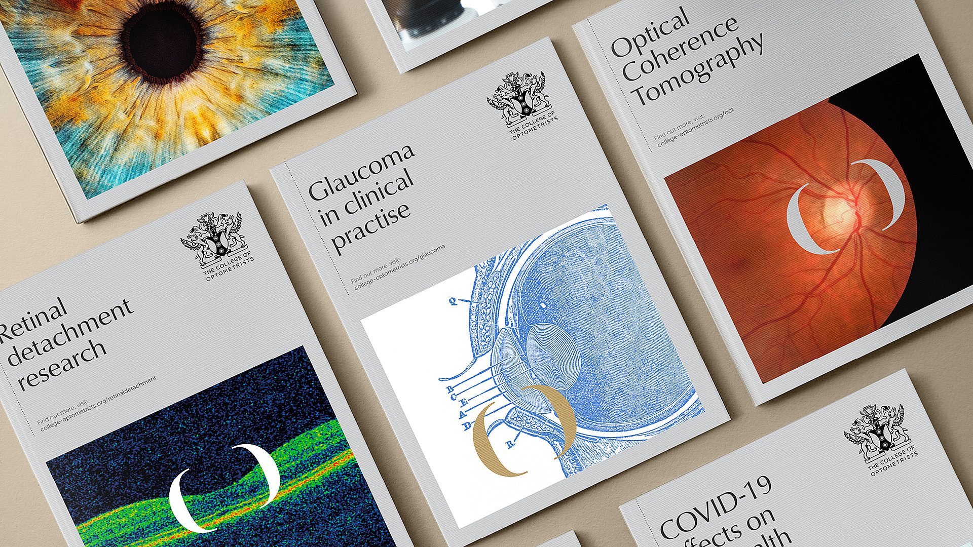
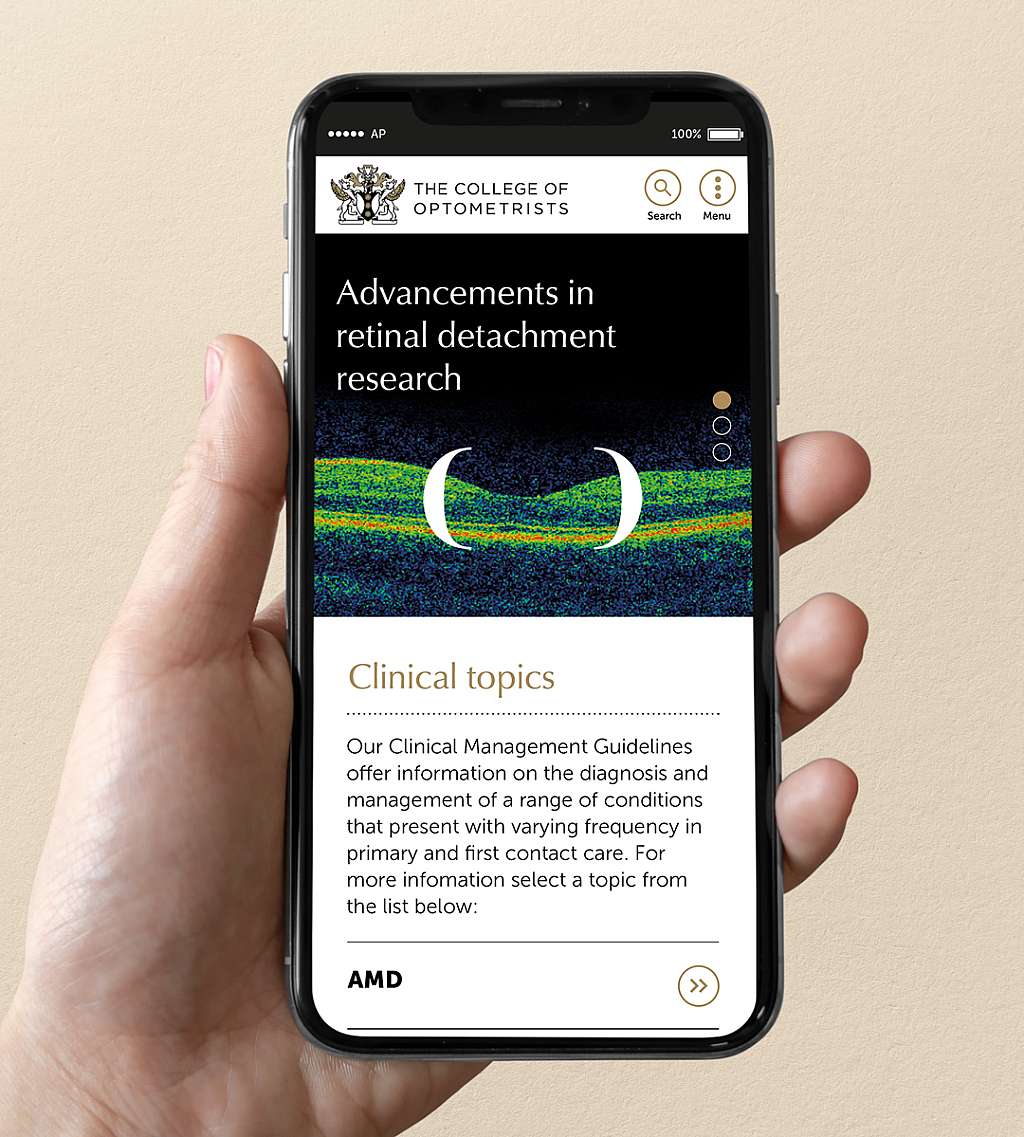
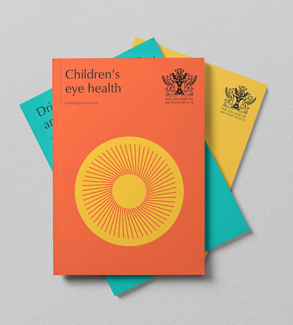
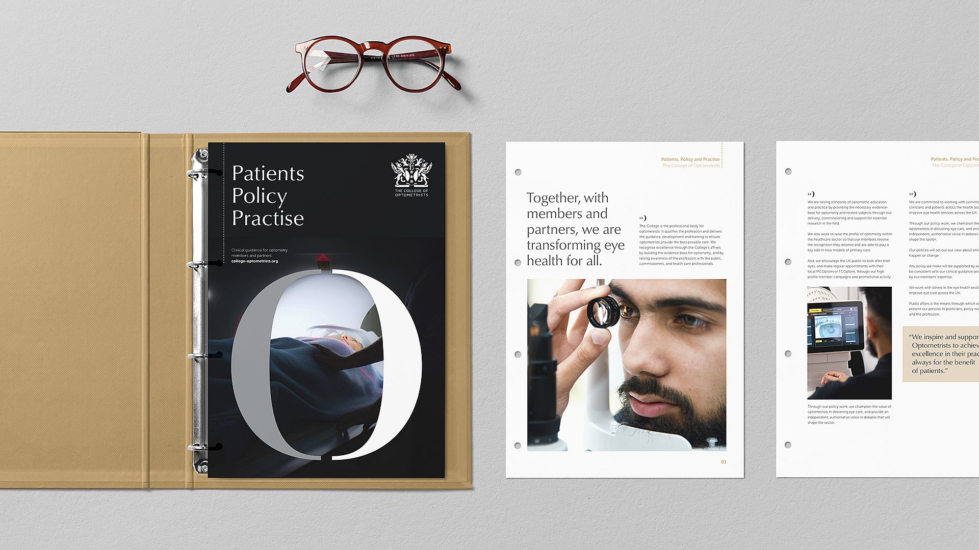
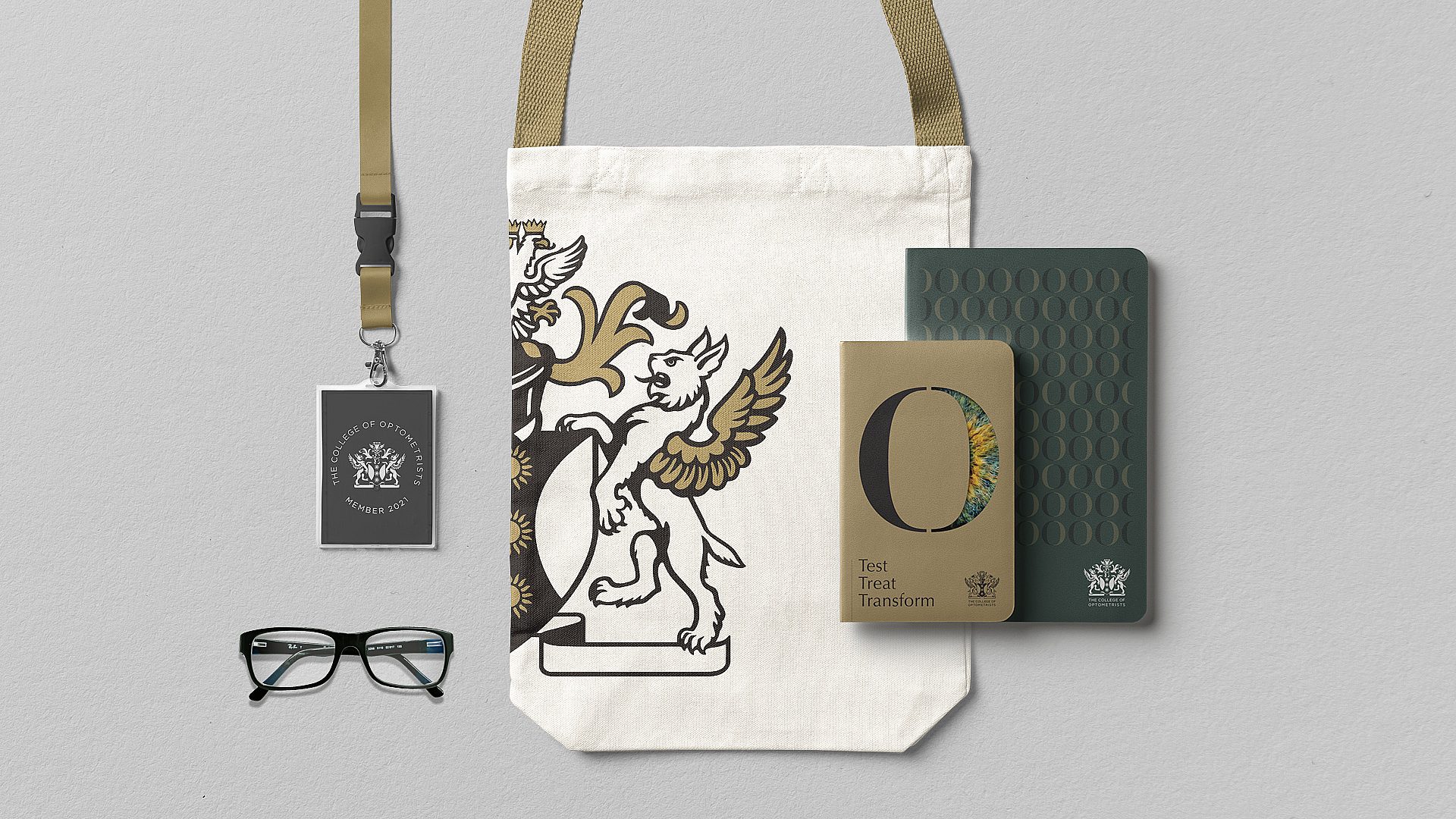
The College of Optometrists, the UK’s leading professional body for optometrists, faced a rapidly changing landscape, with evolving regulations and increasing competition. To strengthen its position and better serve both members and patients, the College needed a refreshed brand strategy that would resonate with its members’ aspirations and align with the profession’s future.
We helped the College shift its focus from being seen as merely qualifying optometrists to championing excellence in eyecare. While previous suggestions were for a more modern creative expression, our research revealed that members wanted a deeper connection to the rich history of optometry. We made this heritage central, with a new, hand-crafted representation of the College’s heraldic achievement, symbolising both its tradition and progressive approach.
Along with this, the brand architecture was rationalised to ensure greater coherence across the College’s work, helping to unify its various initiatives and streamline its communication.
“Through the process, it became clear that we had to retain and build on our heritage whilst adding a new perspective on our role for our members, our profession and our patients. We needed our eyes to be opened by the insight and strategic thought provided by the team at True North.”
Victoria Coss, Head of Marketing & Communications, The College of Optometrists
